


At HyperVerge, we ran a 3-month long project to ensure our team was as effective in the WFH world as earlier. As this project comes to a close, we share what we learnt.
What do organisations of the size 50 to 500 do to achieve high effectiveness in the WFH mode? This study aims to answer part of this question in a simple non-glamorous approach. Just to set expectations right, in preview reads, the feedback for this article was was “too long, too heavy, hard to focus on.” Now that your expectations are set, let’s dive in.
What is the definition of WFH?
We have worked from home many times in the past. At the very least, we’ve replied to emails, fixed a presentation, attended a late night or early morning meeting. “I’ll finish this at home” kind of work crosses the line of work-life separation but is it WFH? Typically, we don’t consider a few hours spent working at home as WFH. The least unit of counting WFH is a day.
Earlier, if we’d been sick or had chores to run, we might have chosen to skip going to office and instead “worked from home.” Maybe we had to be there for an unwell child or partner or parent. Or maybe we expected the gas delivery person / passport police verification / KYC agent to visit us at home. Separately, some of us are involved in work that requires long uninterrupted blocks of time which maybe easier to find in the solitude of our homes. For a hundred different reasons we’ve WFH-ed, but for limited time – between 5 to 30% of our total days spent working. For a small percentage of the managed workforce in a company, like a colleague who has fractured their leg, or a parent who wants to spend more time with their newborn, maybe it’s 100% of the time. For managers though, considering all the man-days that go into running a company, only a minority of days are spent at home.
At HyperVerge, before the pandemic, 1 employee spent 100% of days working from home. Another spent 50% of days working from home. The rest might have spent 3 days a month working from home. For the entire company, a fair estimate of the percentage of all person-days worked at home in January 2020 is 2%.
Post March 2020, 100% of all working days are being spent at home. And as we unlock, this percentage will drop, but it is unlikely to return to the earlier numbers in a long time.
Effectiveness
How does one model an ideal workforce? What do we mean when we say “this team is very effective.”
One way is to measure compliance to an activity plan. In my time at Unilever, I’d followed the ubiquitous OTIF – on time in full. Write down all work as a list of comparable activities / tasks with a date next to it. If the task is finished within the date, it gets a 1, else 0. The OTIF score is the average of this. Is a team with a high OTIF score in a WFH mode an “effective WFH team”?
Another school of thought is to think of outcomes, and not activities. In Who: The A Method for Hiring, the author recommends to describe roles as a set of outcomes, and create a scorecard for each role. Does a team that delivers outcomes from home form an effective WFH team?
The practice of management offers formal and informal ways to improve personal effectiveness – but almost all of them are written for a world where people come together to work in an office. In a WFH world, much is different. Consider these:
- We cannot visually tell if a person is happy/sad/grumpy.
- It’s harder to “share a moment” of co-creation and joy.
- It’s tough to create “team energy” remotely.
- We cannot serendipitously bump into each other.
- We cannot have celebrations in the office / or at an offsite.
Parameters
As we apply older methods, or experiment with newer ones, we need to create a scaffolding to measure WFH effectiveness at a regular frequency. Which begs the question: what are we going to measure?
At HyperVerge, we chose to focus on 4 parameters, which we shall call CPCO:
- Comfort: In mid-March, when the pandemic started, we hypothesised that the sudden change in routines will cause discomfort leading to loss of mental/inner peace – which is a key priority at HyperVerge.
- Productivity: This is really the most obvious direct choice of parameters.
- Connectedness: Because of the sudden loss of a common office space, we decided to make connectedness (to colleagues) a priority.
- Optimism: We were worried that the barrage of pandemic related bad news on news media and social networks would cause people to feel sad, sadder, saddest.
These parameters have served us well form April to June. We might add/remove parameters as we go ahead in our WFH journey.
Measurement
The easiest way to measure CPCO is to … just ask. We designed a simple form, and asked each respondent to give us a number between 1 to 10 with 10 ranking most. Everyone fills this once a week, together, on a Thursday, after the all-hands team meeting.
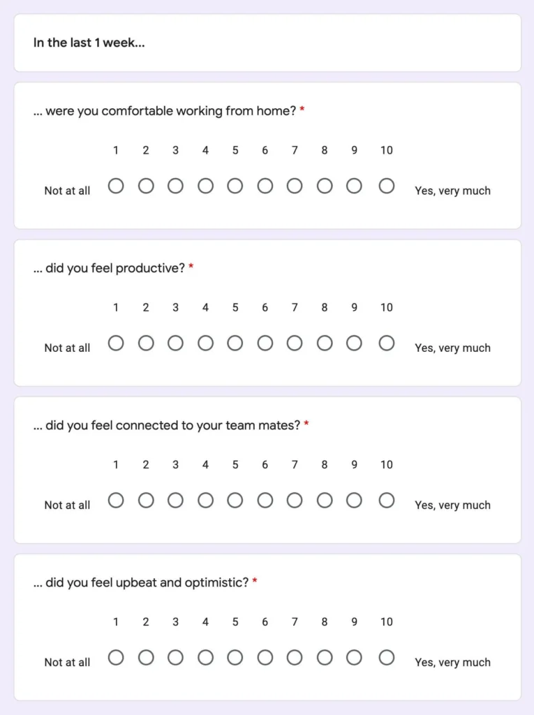
Note that there is a difference between ‘feeling productive’ and ‘being productive’ and we chose to ignore this difference.
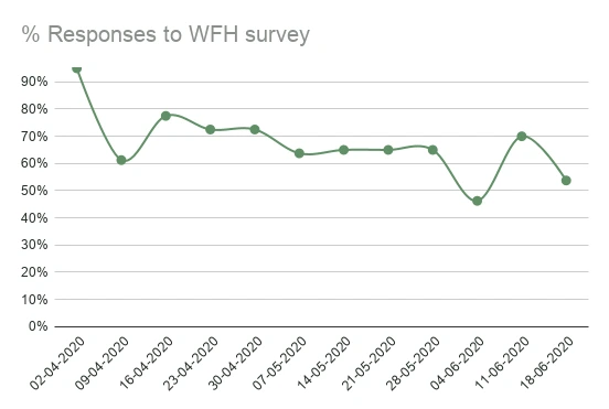
Is everyone filling the form?
As the weekly form filling exercise was voluntary (not compulsory), we observed fluctuation in number of form fills. Making it compulsory would have meant that people would have filled it without reflection and we’d have unreliable data. The tools we used to get greater fills were peer persuasion and executive request (Kedar, our Co-Founder and CEO asks for the form-fills).
Are the responses honest?
At the start of this exercise, in mid-March, we worried about the honesty of everyone’s form-fill – will respondent’s replies reflect their true feelings? But even a cursory look at the data was sufficient to believe that most of the data is honest. Moreover, after tracking 3 months of the same metrics, one can look at trends rather than individual scores and gather insights from the weekly changes.
Are the responses biased?
Most definitely the responses are biased to each respondent’s individuality. If I am asked “did I feel productive” – I might answer a 7 and you might answer a 6, even if both of us were equally productive. However, if we’re similarly inconsistent every time, then the overall effect on the data interpretation can be minimised.
Creating a dashboard
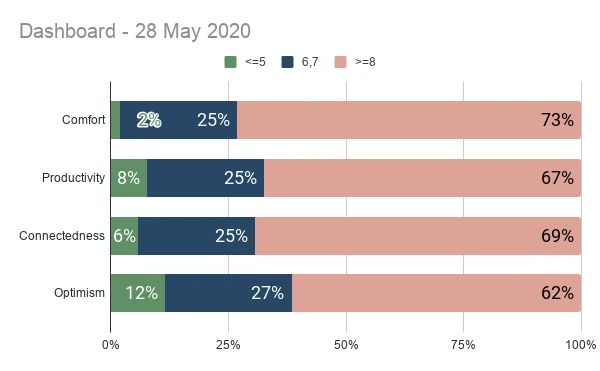
What we wanted was a dashboard of WFH effectiveness. Something that we can use every week to understand the overall picture and respond to it. So it was important to keep the final output simple. For every parameter, we decided to count what percentage of people responded between 1-5, 6-7 and 8-10. We decided that <5%, <15%, and >85% are ideal numbers and that would be our target.
Adding a qualitative layer
Any quantitative measurement hides as much as it shows. So every week we added qualitative questions (non compulsory) for those respondents who wanted to qualify their responses. To keep things fresh, we changed the questions often. Some of the questions we asked were:
- Who in the team do you think needs the most help right now?
- How can we help you?
- How can you help a colleague in this situation?
- What do you feel about WFH permanently?
- What do you miss about office?
The data
https://www.slideshare.net/slideshow/embed_code/key/D8tSjC4RBiABDq
Weekly productivity and morale tracker – June 18 from Amrutash Misra
Reacting to the data
We formed an internal-communication team which would look at the data once a week. Our most obvious task was to reach out to people with low CPCO informally and listening to them. We avoided solving problems in these reach-outs because many of the problems were linked to issues we couldn’t solve like family problems, or even city and country level issues.
Not that we were always passive in our response. We used quantitative and qualitative data to flag issues and solve problems. Here are a few things that improved scores:
- Clarity and communication from leadership on a wide range of topics
- Praise from each other in team meetings
- Achieving hard deadlines together as a team
- Community service – money and time
- Loosely scheduled large team games (like ‘Wolf/Mafia’)
- Non-work (structured) conversations (like ‘Toast and Roast’)
Unfortunately, we live through times where things are tough for each of us. All of us have had friends/family fall sick due to COVID. We’ve been locked in for weeks and months. We’ve had to juggle domestic and professional work. We’ve had to deal with a flood of bad news. So there are many macro-reasons that pull the scores down. Yet, open conversation around difficult topics have made things better.
It feels like the methods that make teams more effective in the WFH world are similar to those we used in the office world in principal – better communication, better clarity, meaningful work, conversation, games …
A culture shock
Every parameter that we measured went through a yo-yo. This is consistent with the model of culture-shock among international students, where students have to adapt to a new environment very quickly without the support system they were used to earlier. If the culture-shock analogy is correct, then we can expect the yo-yo to stabilise over time as we transition from an office environment to a WFH environment.
Summary
To improve WFH effectiveness, there has to be a data collection scaffolding. This should be simple enough to create an actionable dashboard. A few representative metrics could be chosen. They may be measured via a form to keep things simple. There will be limited bias/disconnect – a sanity check on the data may be able suggest if this unacceptably high.
The data that is being generated must influence action. An action team could look into the data every week. They must listen to individuals with low scores and respond with org-wide initiatives.
Lastly, all of the data will yo-yo irrespective of what action is taken.
Acknowledgements: My colleague Deepak worked with me on this. HyperVerge Co-founder Kishore and coach Cheenu oversaw the project.